Let’s dive into how I stood up my own static website blog, blog.kylegalbraith.com, by using GatsbyJS, TailwindCSS, and of course my go-to for all things website hosting related, Amazon Web Services. In this post I will cover the following topics:
- Getting started with Gatsby + TailwindCSS for a static website blog.
- Setting up your initial blog.
- Implementing common functionality pieces for SEO and social sharing.
- Bonus Points: Configuring the AWS infrastructure to host your blog.
Sounds like a solid plan right? Let’s get started.
GatsbyJS + TailwindCSS == Awesome
I have blogged about TailwindCSS before in my post about launching the Learn By Doing newsletter. It is a fantastic utility first CSS framework that comes with a lot of bells and whistles out of the box.
Additionally, in my Learn AWS By Using It course we use GatsbyJS to create a demo static website that we can then use to learn core AWS concepts such as hosting, securing, and deploying static websites.
So for my blog, I decided to mash them together. I wanted the simplicity of a static website generator like Gatsby with the ability to quickly style it using TailwindCSS. So, I created a starter (aka boilerplate) Gatsby project that lays out all of the configuration necessary to use the Gatsby static website generator pre-configured with Tailwind.
To get started, you need to install the gatsby-cli from NPM.
npm install --global gatsby-cli
Next, you need to create a new Gatsby project in a directory of your choice using the
gatsby-starter-tailwind-seo-social project.
gatsby new kylegalbraith-blog https://github.com/kylegalbraith/gatsby-starter-tailwind-seo-social
This will create a new folder, kylegalbraith-blog, in your current directory. Inside of this folder is all of the
boilerplate and initial configurations for the Gatsby site and TailwindCSS. If we run a quick develop command we can
see what the initial site looks like.
cd kylegalbraith-blog
gatsby develop
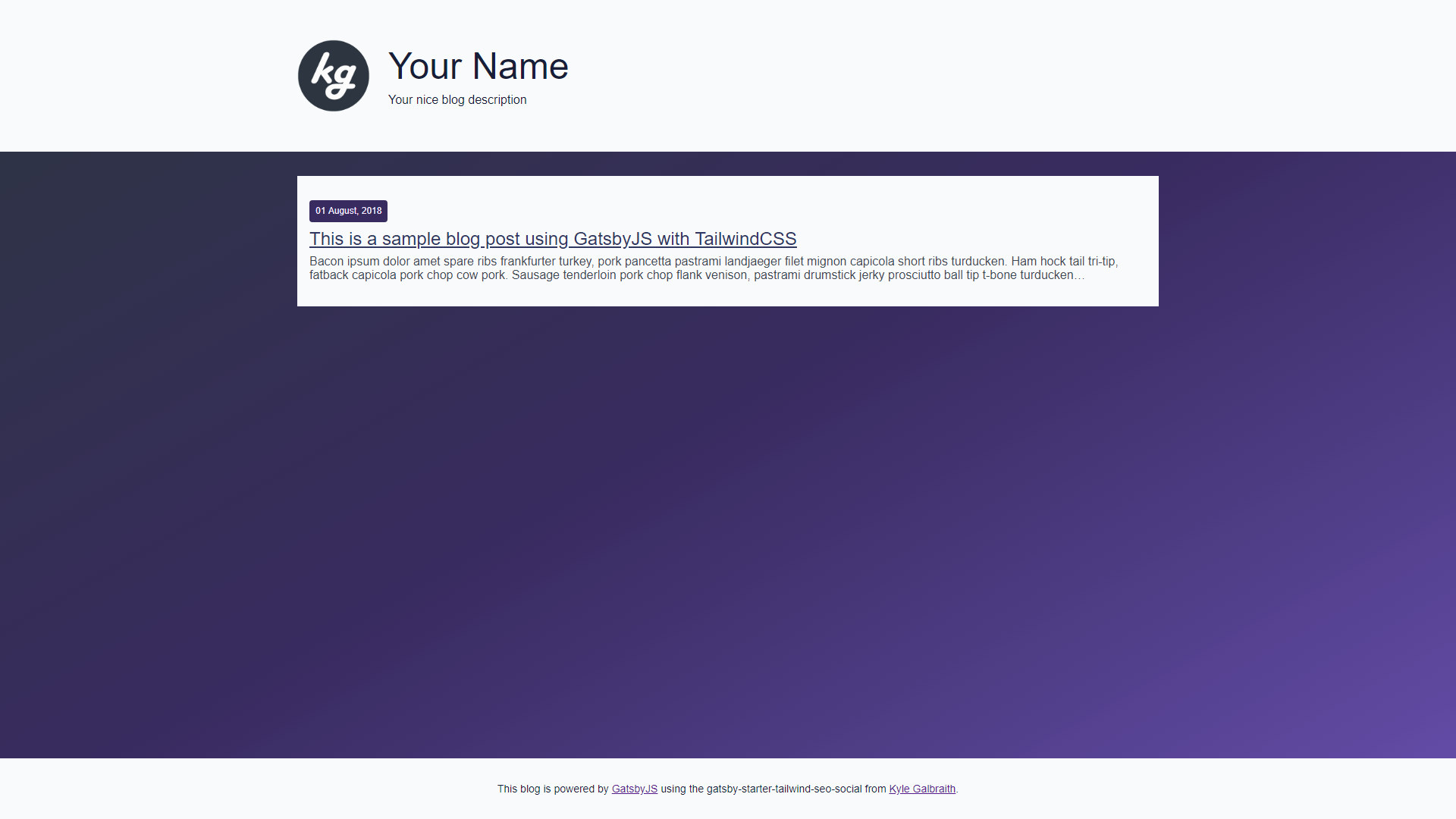
What we should end up seeing is something along these lines.
With me so far? Excellent.
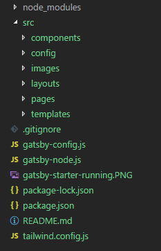
With the starter project pulled down, you can begin by opening it up in Visual Studio Code or your favorite IDE. If you take a look at the folder structure you see a couple of different things.
The first thing to get familiar with is the src directory. This is where all the code lives that composes your blog.
GatsbyJS is a React based static website generator so everything is defined in terms of components, static assets,
layouts, and pages.
If you expand the components folder and open the Header component you see code that looks like this.
import React from 'react'
import Link from 'gatsby-link'
import logo from '../../images/favicon.png'
import config from '../../config/config'

const Header = () => {
  return (
    <nav className="bg-grey-lightest">
      <div className="container mx-auto p-4 md:p-8">
        <div className="text-center lg:text-left">
          <Link to="/" className="text-grey-darkest items-center no-underline hover:text-black lg:inline-flex">
            <div className="mb-4 flex-1 pt-5">
              <img
                src={logo}
                alt="The blog of Kyle Galbraith, Software Engineer & Entrepreneur"
                className="border-indigo-darkest mr-4 h-24 w-24 rounded-full"
              />
            </div>
            <div className="flex-2">
              <h1 className="font-hairline text-indigo-darkest ml-2 text-5xl">{config.authorName}</h1>
              <span className="font-hairline text-indigo-darkest ml-2 mt-2 block">{config.siteDescription}</span>
            </div>
          </Link>
        </div>
      </div>
    </nav>
  )
}

export default Header
This is the header component for the Gatsby blog. Right now this is still a boilerplate blog. Let’s spice it up by
changing some configuration settings in src/config/config.js. You can update the authorName and siteDescription to
match your information.
module.exports = {
  siteTitle: 'Your Blog Title',
  shortSiteTitle: 'Your Short Blog Title',
  siteDescription: 'This is an awesome blog that you are going to make your own.',
  siteUrl: 'https://blog.kylegalbraith.com',
  pathPrefix: '',
  siteImage: 'images/facebook-cover.jpg',
  siteLanguage: 'en',
  authorName: 'Kyle Galbraith Was Here',
  authorTwitterAccount: 'kylegalbraith',
  authorSocialLinks: [
    {name: 'github', url: 'https://github.com/kylegalbraith'},
    {name: 'twitter', url: 'https://twitter.com/kylegalbraith'},
    {name: 'facebook', url: 'http://facebook.com/kyle.galbraith459'},
  ],
}
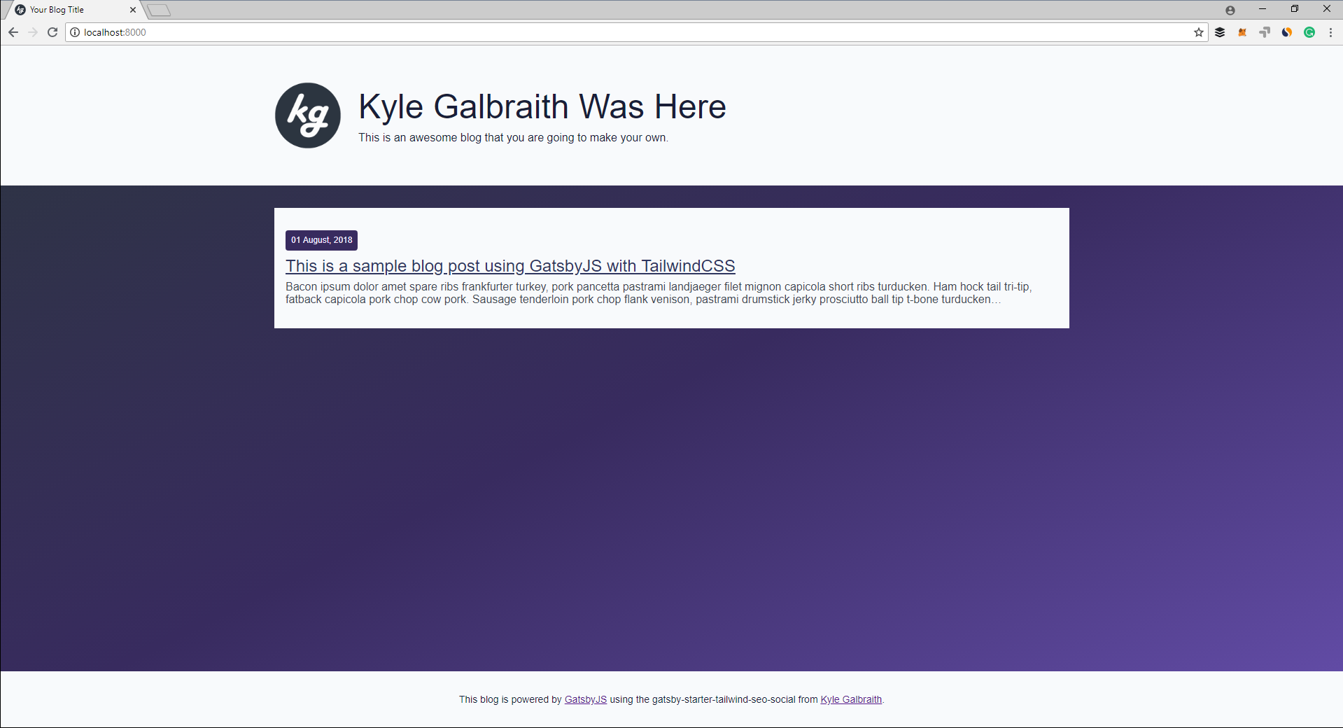
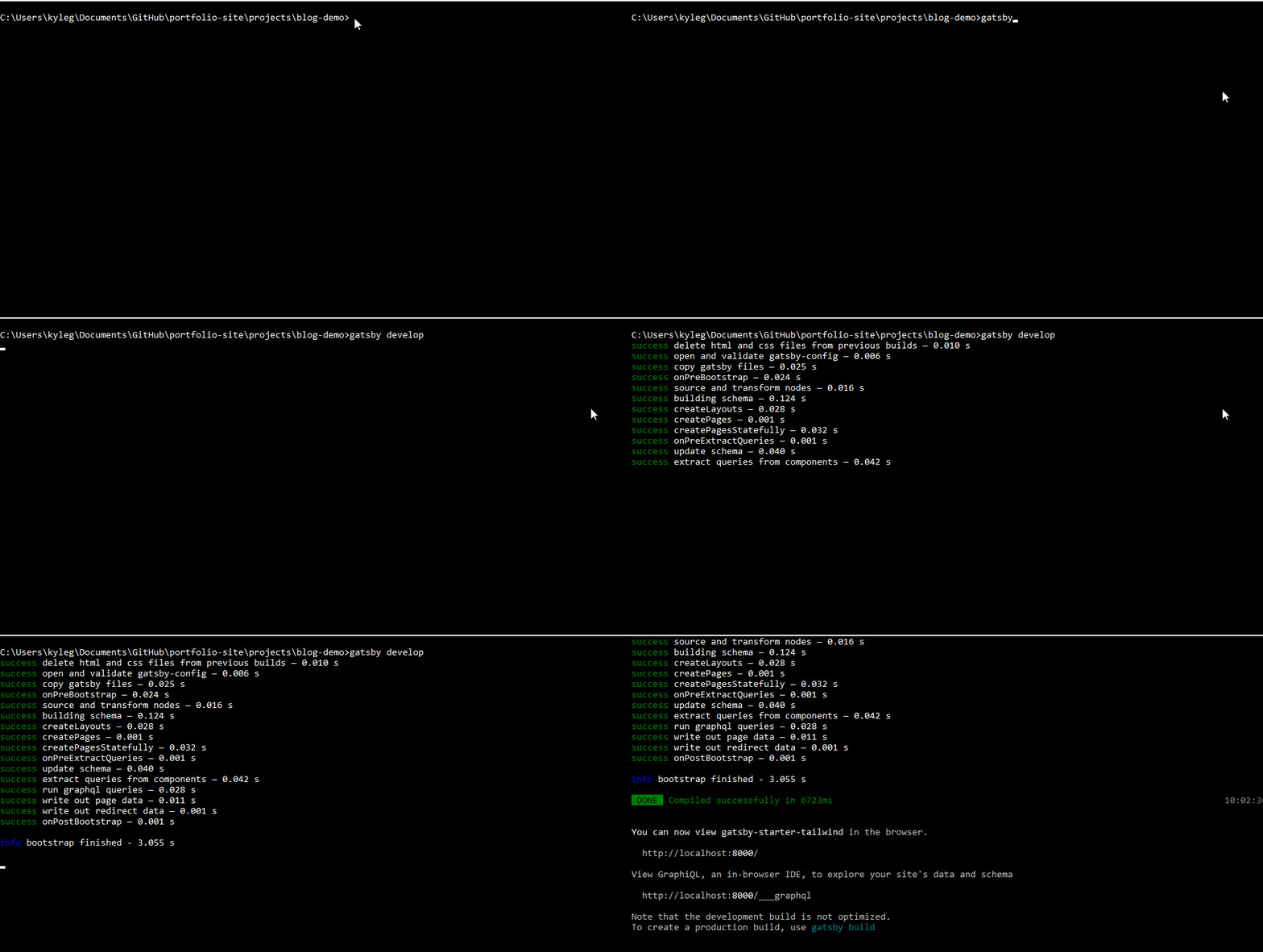
Now that those fields are updated, you can check out the changes live in the browser by running gatsby develop again
from the command line. This command starts a localhost server at port 8000 by default.
Then you can view your changes in the browser. If you keep the develop command running any changes made to components
will be hot reloaded in the browser.
Pretty cool right? You can change any of those configuration settings to match your blog details and the components will automatically update.
Changing content is cool, but you probably want to add your own style as well. Head over to the Footer component and
let’s change the background color of the outer div from bg-grey-lightest to bg-indigo.
import React from 'react'
import config from '../../config/config'

const Footer = () => (
  <div className="bg-indigo">
    <div className="mx-auto max-w-xl p-4 text-center text-sm md:p-8">
      <p>
        <a href={config.siteUrl} className="text-indigo-darkest hover:text-grey-darkest no-underline">
          This blog is powered by <a href="https://www.gatsbyjs.org/">GatsbyJS</a> using the
          gatsby-starter-tailwind-seo-social from <a href="https://blog.kylegalbraith.com">Kyle Galbraith</a>.
        </a>
      </p>
    </div>
  </div>
)

export default Footer
Now the footer for your blog should be a blue color. By using TailwindCSS you can use a lot of pre-built utility classes that allow you to rapidly develop new UI components or change the style of existing ones.
But at some point, you are going to want to assign your own custom CSS to a component. That is handled by adding a
custom style to index.tailwind.css under src/layouts. Scrolling to the bottom you can see there is already a custom
style defined for the body element to add the background gradient. Let’s change the gradient to something else.
body {
  background: #1f4037;
  background: -webkit-linear-gradient(to right, #99f2c8, #1f4037);
  background: linear-gradient(to right, #99f2c8, #1f4037);
}
To update stylesheets you need to run an npm script from the package.json. The build:css script will run the
tailwind command and output the final CSS.
npm run-script build:css
...
> tailwind build ./src/layouts/index.tailwind.css -c ./tailwind.config.js -o ./src/layouts/index.css

Building Tailwind!
Finished building Tailwind!
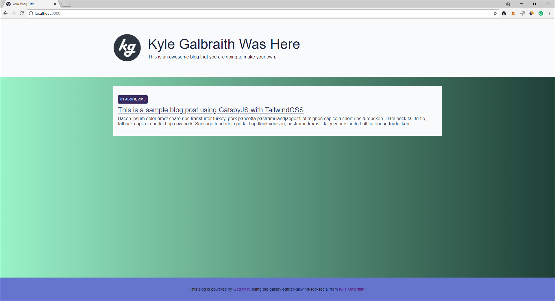
Now checking localhost again you can see that the background gradient has been updated.
That is the boilerplate setup for your Gatsby + TailwindCSS blog setup. You can leverage existing Tailwind utility classes or add and extend your own to style the blog further. You can also build your own components to add new functionality to your blog.
Setting up the actual blogging piece
Gatsby is a fantastically simple blogging platform that allows you to write blog posts in Markdown. As you can see from the boilerplate starter there is already a blog post created. If you click on the blog post you can see a blog post loaded with tasty bacon ipsum.
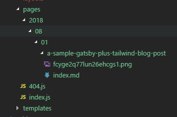
If you take a look at the url of the blog post you should see the following format,
2018/08/01/a-sample-gatsby-plus-tailwind-blog-post/. This is defined by the folder structure under the pages
directory.
The blog post is written inside of the markdown folder, index.md and the image is the cover image you see defined at
the top of the post. This is also the image that will be used when shared on Facebook and Twitter.
But how does the markdown post become the HTML post?

OK, not really. It’s actually handled by two plugins located in gatsby-config.js called gatsby-source-filesystem and
gatsby-transformer-remark. The first loads the files from the pages directory and feeds them into the transformer
that turns the markdown syntax into proper HTML.
You can create a new blog post by creating a new directory under the 08 directory and initializing a new markdown
file.
mkdir pages\2018\08\02\new-post
touch pages\2018\08\02\new-post\index.md
Now you can add some new content to your new markdown file.
---
title: This is a new post
date: '2018-08-02'
cover: ''
---

A brand new blog post from here.
If you refresh your localhost blog you should see that you have a new blog post with the title from your markdown file.
Easy peezy right?
Now that you know how to use Gatsby to rapidly develop your new blog and style it to fit your needs using Tailwind, let’s explore the SEO and Social Sharing components built into this starter project.
SEO and Social Sharing
If you are putting in the hard work to write content on your blog you want to make sure you are getting it into the hands of the people that would find it useful. This can be done by optimizing the SEO of your posts and making it easy for other readers to share your content.
Lucky for you, that is built into this Gatsby starter project.
Taking a look under the templates directory you can check out the blog-post.js file. This is the template that
defines how an individual blog post appears on your blog.
return (
  <div className="bg-grey-lightest p-4 text-left shadow-lg">
    <Seo data={post} />
    {post.frontmatter.cover && (
      <Img sizes={post.frontmatter.cover.childImageSharp.sizes} alt={post.frontmatter.title} className="w-full" />
    )}
    <h1 className="text-indigo-darker mb-2 mt-6 text-3xl font-normal lg:text-5xl">{post.frontmatter.title}</h1>
    <p className="mb-8 block border-b-2 pb-4">
      📅 {post.frontmatter.date} – {config.authorName}
    </p>
    <div className="blog-content" dangerouslySetInnerHTML={{__html: post.html}} />
    <div className="social-content mt-16 border-t pt-8 text-center">
      <p className="font-light">Did you enjoy this post? Share the ❤️ with others.</p>
      <Social url={url} title={post.frontmatter.title} />
    </div>

    <ul
      className="mt-8 border-t-2 pt-4"
      style={{
        display: 'flex',
        flexWrap: 'wrap',
        justifyContent: 'space-between',
        listStyle: 'none',
        paddingLeft: 0,
      }}
    >
      <li>
        {previous && (
          <Link to={previous.fields.slug} rel="prev" className="text-indigo-darker hover:text-indigo-lighter">
            ← {previous.frontmatter.title}
          </Link>
        )}
      </li>
      <li>
        {next && (
          <Link to={next.fields.slug} rel="next" className="text-indigo-darker hover:text-indigo-lighter">
            {next.frontmatter.title} →
          </Link>
        )}
      </li>
    </ul>
  </div>
)
Taking a look at the HTML template that is returned you can see that there are two custom components Seo and Social
being used. So what exactly are they doing?
If you take a look at the Seo component you can see that it is returning a React Helmet component.
<Helmet
  htmlAttributes={{
    lang: config.siteLanguage,
    prefix: 'og: http://ogp.me/ns#',
  }}
>
  <title>{title}</title>
  <meta name="description" content={description} />
  <link rel="shortcut icon" href={favicon} />

  <meta property="og:url" content={url} />
  <meta property="og:title" content={title} />
  <meta property="og:description" content={description} />
  <meta property="og:image" content={image} />
  <meta property="og:type" content="website" />

  <meta name="twitter:card" content="summary" />
  <meta name="twitter:image" content={image} />
  <meta name="twitter:description" content={description} />
  <meta name="twitter:creator" content={config.authorTwitterAccount ? config.authorTwitterAccount : ''} />
</Helmet>
The component takes an individual blog post and returns the necessary HTML for a title, description, and favicon. Tags
that are very important to SEO. It is also returning the necessary meta tags for Facebook, og:url, and Twitter
twitter:description. Every blog post in your new Gatsby blog will automatically get this optimization by using the
content in your post.
But you also want your content to be easily shareable. So let’s take a look at what the Social component is adding to
each blog post.
<ul className="list-reset inline-flex">
  <li className="p-4">
    <TwitterShareButton url={url} title={tweet} className="button">
      <TwitterIcon size={32} round={true} />
    </TwitterShareButton>
  </li>
  <li className="p-4">
    <FacebookShareButton url={url} quote={title} className="button">
      <FacebookIcon size={32} round={true} />
    </FacebookShareButton>
  </li>
</ul>
Here the react-share component is being used to create Twitter and Facebook share buttons. Each is pre-filled using
the title and url of the blog post so that when a user clicks on them they have the content ready to be posted.
Bonus Points: Configuring the AWS infrastructure to host your blog
If you are looking to start learning Amazon Web Services then this bonus section is for you.
This part of the post assumes you already have an AWS account setup and an introductory understanding of the platform. If AWS is totally new to you, consider grabbing a package of my learn AWS course that focuses on teaching you the platform by actually using it. In my course, we focus on learning core AWS services like S3, CloudFront, Lambda, and API Gateway by actually using them to host, secure, and deliver static websites.
Included in the starter project is a deployment folder. In this folder, I have included a Terraform template that
configures AWS resources to host your blog. This template provisions the following resources within your AWS account.
- An S3 bucket that is configured for static website hosting. The name of the bucket must match the url of your blog.
For example, my blog is at
blog.kylegalbraith.comand therefore the bucket is namedblog.kylegalbraith.com. - A CloudFront CDN distribution that sits in front of your S3 website bucket. It is also configured to have SSL via the ACM certificate you pass in. Check out this blog post if you aren’t familiar with adding SSL to your static website in AWS.
So how do you actually deploy this infrastructure? Great question. Here are the steps you should follow in order to deploy the AWS infrastructure for your blog.
- Make sure you have the AWS CLI installed and configured to interact with your AWS account.
- Install Terraform and add it to your
PATHso you can execute it from anywhere. - Now you can initialize the Terraform template from within the
deploymentdirectory.
cd deployment
terraform init
...
Initializing provider plugins...
Checking for available provider plugins on https://releases.hashicorp.com...
Downloading plugin for provider "aws" (1.30.0)...
- With the providers initialized, you can run
terraform planin order to get a visualization of what resources are going to be created. You can pass the necessary variables fromvariables.tfinto theplancommand via the-varflag as you see below.
terraform plan \
    -var blog_url=blog.yourcoolsite.com \
    -var acm_certificate_arn=arn:aws:acm:us-east-
1:yourAccountId:certificate/yourCert
...
The refreshed state will be used to calculate this plan, but will not be
persisted to local or remote state storage.
...
An execution plan has been generated and is shown below.
Resource actions are indicated with the following symbols:
create
    Terraform will perform the following actions:
      + aws_cloudfront_distribution.blog_distribution
- The
planmethod tells you what resources are going to be provisioned. To initiate the provisioning you must runterraform apply, passing the same variables as before.
terraform apply \
    -var blog_url=blog.yourcoolsite.com \
    -var acm_certificate_arn=arn:aws:acm:us-east-:yourAccountId:certificate/yourCert
...
Do you want to perform these actions?
  Terraform will perform the actions described above.
  Only 'yes' will be accepted to approve.
  Enter a value: yes
aws_s3_bucket.blog: Creating...
- The
applycommand takes a few minutes to complete while the S3 bucket and CloudFront distribution are created. If you want to skip the approval step you see above, pass the-auto-approveflag to theapplycommand. - Once the
applycommand completes you are going to have a brand new CloudFront distribution configured with the S3 website bucket as an origin where your blog is going to be hosted. The next step is to update your DNS records in order to route your blog traffic to the CloudFront distribution.
With your AWS infrastructure provisioned you can now deploy your Gatsby blog to your S3 bucket. This is done by running
the build script in the package.json and then running an S3 copy command from the AWS CLI.
npm run-script build
aws s3 cp public/ "s3://blog.yourcoolsite.com/" --recursive
This script runs the build:css configuration that produces our final TailwindCSS. It then runs gatsby build which
generates a production build and outputs the contents into the public directory. From there it is just a matter of
copying the contents of that directory to the S3 bucket where your blog is hosted.
Conclusion
I prefer processes that are as frictionless as humanly possible. I become disengaged when the process is cumbersome and very manual because this often means spending time on things that aren’t valuable. There are only 24 hours in a day so wasting time on a cumbersome manual process is less than ideal.
In the past, creating a blog has always had that vibe in my mind. My journey started with writing raw HTML, not fun. Then came things like WordPress, better but still slow and a lot of overhead. Finally, I switched to platforms like dev.to and Medium, this was awesome because it streamlined the creative process and allowed me to just focus on the content.
But, I still had a need to showcase my content on something that I owned. Gatsby solved this problem and kicked ass while doing it. The folks over there have created a great open source project with a strong and vibrant community.
Hopefully, you have seen how easy it is to get a blog up and running using tools like Gatsby and Tailwind. Once you have something created you can then get it deployed to AWS, as you saw here, or any other hosting platform for static websites.

